Reimagining Chromatography for Advanced Therapies: From Diffusion to Convection — BCI
For more than a century, bead-based chromatography has been the foundation of purification. It has served us well from producing lifesaving biologics to everyday applications such as high-fructose sweeteners and water purification treatment. But today, as advanced therapies such as gene therapies, mRNA vaccines, viral vectors, exosomes and cell therapies reshape the future of medicine, the limitations of diffusion-based purification are becoming impossible to ignore. The reality is simple: Methods designed a hundred years ago cannot keep pace with the therapies of tomorrow. Incremental improvements won’t solve the problem. What we need is a fundamental shift — one that replaces slow diffusion with rapid convection. This conviction led me to co-found BioChromatographix International (BCI) in Singapore, alongside my colleague and friend Chervee Ho. Chervee is not only a remarkable marketing strategist but also someone who deeply understands how to connect innovation with real customer needs. I feel truly fortunate to have her as a co-founder, because if there is one lesson I have learned, it is that groundbreaking technology only matters when it’s paired with customer-centric execution. The Problem, the Solution and Why It Matters The Problem: Traditional bead-based chromatography is diffusion-limited. While effective for proteins and small molecules, it struggles with large biomolecules — viruses, plasmids, mRNA, exosomes and others that cannot access most of the pore volume. This makes purification slow, inefficient, and costly. The Solution: At BCI, we developed the AXISFLOW™ platform: a monolithic chromatography medium with interconnected microchannels. Instead of diffusion, liquid moves through these channels by convection, enabling rapid and efficient purification even for the largest biomolecules. In essence, we remove the diffusion bottleneck — delivering purification that is faster, more scalable, and more cost- effective. Why This Matters: The promise of advanced therapies is extraordinary, but their cost of goods remains a critical barrier to patient access. If purification cannot keep pace, many therapies will remain out of reach. AXISFLOW™ directly tackles this bottleneck — helping innovators cut costs, shorten timelines, and bring next-generation treatments to the people who need them most. Breaking Beyond Beads To appreciate the shift, consider how traditional chromatography works. Porous beads provide surface area, but molecules must slowly diffuse in and out of tiny pores. This design is efficient for small molecules, but for large biomolecules, diffusion is a roadblock. AXISFLOW™ replaces beads with a monolithic solid phase — a sponge-like structure full of interconnected channels just a few microns wide. Instead of being forced into dead-end pores, liquid flows freely through these paths, carrying molecules across a vast surface area at high speed. Think of it this way: A bead-packed column is like stacking oranges in a box, where liquid trickles only around the gaps. AXISFLOW™, in contrast, is like a sponge that liquid moves through the entire structure with ease. This is what makes convection the future of purification. Innovation Starts with Imagination Over the years, I have come to believe that innovation is too often held back by a lack of imagination. Drug development has always advanced in step with our ability to measure. As soon as we gain new ways to quantify molecular properties or biological effects, we unlock new opportunities in design. Bioprocessing is no different. Today, tools like advanced analytical testing and additive manufacturing allow us to imagine and realize entirely new purification approaches. What once required months and tens of thousands of dollars to prototype can now be tested within days. At BCI, these tools have been essential in developing and refining AXISFLOW™. Imagination drives new ideas. Measurement and iteration make them real. Together, they open doors to the future of bioprocessing. Building with the End-User in Mind One of the most important lessons I’ve learned is that science alone doesn’t guarantee success. Many brilliant technologies fail not because they don’t work, but because they don’t solve the right problem for the end-user. That’s why at BCI, we engage early with innovators and collaborators. We provide sample materials during process development so our partners can test, validate and adapt their workflows from the very beginning. This ensures AXISFLOW™ is applied where it delivers maximum value while avoiding costly rework or regulatory disruption down the road. Ultimately, process development is not research for its own sake. It is about delivering safe, effective products to patients faster, at lower cost, and at higher quality. That means starting with the end-user in mind, every time. Why Biotech Moves Slowly and How We Can Help Our industry is famously conservative in adopting new technologies. Unlike consumer products, where multiple models can be released under one approval, every drug requires its own license. That makes changes expensive, time-consuming, and risky. The best way to overcome this barrier is by integrating new technologies early in development. By adopting AXISFLOW™ at the start, companies can build purification strategies that scale with them — avoiding painful changes later, while gaining efficiency and lowering costs from day one. Looking Ahead Throughout my career, I have been fortunate to be part of transformative moments: helping develop the first HIV and hepatitis C diagnostics in the U.S., building biotech companies in China and now pioneering purification innovation in Singapore. The common thread across all of these experiences is clear: Progress happens when science, engineering and customer needs align. With AXISFLOW™, we aim to bring that alignment to the next generation of advanced therapies. By moving from diffusion to convection, we can make purification faster, more scalable, and more accessible — ensuring that therapies don’t just remain scientific achievements, but become realities for patients worldwide. I am deeply grateful to the BCI team, and especially to Chervee, for the vision and drive that make this possible. Together, we are reimagining chromatography and shaping a future where efficiency truly exists in every channel. Opportunities are everywhere. The challenge is to imagine them clearly — and the responsibility is to turn them into solutions that make a lasting difference. Pop over here : www.biochromatographix.com
Read more


Flyer Design That Works: How to Create High-Converting Flyers for Your Business in Singapore — Subra
In the digital marketing age, you might think physical marketing tools like flyers are obsolete. But that couldn’t be further from the truth. When designed correctly, a flyer is a compact, high-impact marketing tool that grabs attention, delivers your message clearly, and drives real results — especially for local businesses in Singapore. Whether you’re promoting a grand opening, limited-time sale, product launch, or corporate service, a well-crafted flyer can: Reach a targeted audience Deliver instant impact Provide high ROI on a low budget But here’s the catch: it’s not just about what you say — it’s how you present it. And that’s where flyer design comes into play. Let’s explore how businesses can use flyer design effectively and why working with a pro like Subraa makes all the difference. What Makes a Good Flyer Design? An effective flyer is not just a piece of paper — it’s a mini-sales pitch, delivered visually. Here are the essential ingredients that make a flyer truly work: Eye-Catching Headline The headline must grab attention in under 3 seconds. Use power words, questions, or bold offers. Example: “50% OFF This Weekend Only!” “Need a New Website? Let’s Talk!” Make it BIG, bold, and easy to read at a glance. Clear Branding Your flyer should reflect your brand identity — use your logo, brand colours, and fonts consistently. This builds trust and ensures people can connect the flyer to your business instantly. Visual Hierarchy Use contrast, whitespace, and font sizes strategically. Readers should be able to skim the flyer and still get your message. A well-structured flyer tells them: What’s the offer? Why should they care? What should they do next? Call-to-Action (CTA) Every flyer needs a strong CTA. Think: “Call now” “Visit our store” “Scan the QR code” “Show this flyer for 10% off” The CTA should be bold, direct, and impossible to miss. High-Quality Images Use sharp, relevant images. No pixelation, no clutter. Images speak louder than text. If you’re a restaurant, show mouth-watering dishes. If you’re a salon, flaunt your best before-after shots. Where Flyers Work Best in Singapore Flyers work especially well for hyperlocal marketing. Here are some real-use cases: Retail Stores & Cafés — Promotions, opening events, seasonal sales Real Estate Agents — New listings, open house announcements Gyms & Studios — Class schedules, trial offers Freelancers & Designers — Service promos, portfolio highlights Events & Exhibitions — Launch invitations, ticketing info F&B Outlets — Delivery menus, bundle deals Flyers can be handed out at malls, MRT stations, cafes, community centres, or mailed directly to HDBs and condos. They’re perfect for getting instant attention in high-footfall areas. Common Flyer Mistakes to Avoid If your flyers aren’t converting, these could be the culprits: Too much text No clear value proposition Low-resolution images Weak or missing CTA Poor layout and colour contrast Outdated info or contact details Flyers only have a few seconds to impress. Clarity and design matter more than ever. Why Hire a Professional for Flyer Design in Singapore? You might be tempted to DIY your flyer using a free tool. But here’s the truth: A poorly designed flyer will get ignored, trashed, or forgotten. A professionally designed flyer drives calls, sales, and foot traffic. That’s why businesses trust freelance designers like Subraa to create flyers that: Look professional and polished Reflect your brand accurately Are print-ready with correct bleed/margins Are designed for action and conversion Whether you need a flyer for an event, product promo, or service campaign, Subraa offers custom flyer design services that deliver results. Subraa’s Flyer Design Services As a trusted freelance graphic designer in Singapore, Subraa has worked with SMEs, startups, and large companies to create impactful marketing materials — including flyers, brochures, and banners. With Subraa, you get: One-on-one consultation Creative concepts to choose from Print-ready formats (PDF, AI, PNG, etc.) Fast turnaround Affordable, fixed pricing View flyer design portfolio and request a quote at www.subraa.com Final Thoughts: Flyers Still Work — If You Get Them Right Flyers may be old-school — but when designed with intent and creativity, they’re a cost effective, high-impact tool that gets your message out fast. Whether you’re reaching out to local customers, promoting an offer, or launching a new product, the right flyer design can make all the difference. Don’t just print for the sake of printing, design to convert. Need Professional Flyer Design in Singapore? Work with Subraa — Singapore’s experienced freelance designer, for stunning, conversion-driven flyers that work in print and digital. Contact today via www.subraa.com
Read more
Which Mattress Thickness Suits You Best? — My Digital Lock
When it comes to choosing the right mattress, most people focus on firmness, material, or brand. However, mattress thickness is just as important but often overlooked. The thickness of your mattress can directly affect comfort, support, durability, and even the way your bed looks in your room. If you are planning to buy mattress Singapore, understanding how thickness impacts your sleep quality will help you make a smarter decision. In this guide, we’ll explore the different mattress thickness levels, factors to consider, and which thickness is best for different types of sleepers. Why Mattress Thickness Matters Mattress thickness isn’t just about aesthetics. A thicker mattress usually provides more comfort layers, while thinner ones may be more suitable for certain bed frames or specific needs. Here’s why it matters: 1.Support and Comfort — Thicker mattresses often include multiple layers of foam, latex, or spring coils, giving better pressure relief and spinal alignment. 2.Durability — In general, thicker mattresses last longer as they are less likely to sag quickly. 3.Ease of Movement — Thinner mattresses are lighter and easier to move, rotate, or flip. 4. Bed Height — The overall bed height depends on both mattress thickness and bed frame. If your mattress is too thick, it might be difficult to get in and out of bed, especially for children or older adults. Standard Mattress Thickness Categories Mattresses come in different thickness ranges, usually between 5 inches and 16 inches. Here’s a breakdown: 1.Thin Mattresses (5–8 inches) Best for bunk beds, trundle beds, or daybeds. • Suitable for children or light-weight sleepers. Easy to move and more affordable. Not recommended for adults who need long-term spinal support. 2. Standard Mattresses (9–12 inches) Most common choice for everyday use. Provides a balance of comfort, support, and durability. Works well for most sleeping positions. Fits easily into standard bed frames. 3.Thick or Luxury Mattresses (13–16 inches and above) Multiple layers of memory foam, latex, or hybrid springs. Ideal for side sleepers or those with joint pain, as they offer superior pressure relief. Great for couples, as thicker mattresses minimize motion transfer. Heavier and more expensive, not easy to move around. Factors to Consider When Choosing Mattress Thickness When you buy mattress, don’t just pick one based on brand reputation. Consider these key factors: 1.Sleeping Position Back Sleepers — Medium thickness (10–12 inches) works best as it balances firmness and contouring. Side Sleepers — Go for a thicker mattress (12–14 inches) as it provides more cushioning for shoulders and hips. Stomach Sleepers — Medium to thin mattress (8–11 inches) is better for spinal alignment. 2.Body Weight Light-weight sleepers (100kg) — Thicker mattresses (12–14 inches) are recommended for long-term durability and support. 3.Bed Frame Height If your bed frame is already tall, adding a very thick mattress may make the bed uncomfortably high. Ideally, when sitting on the edge of the bed, your feet should touch the floor comfortably. 4.Room Size & Aesthetics In smaller bedrooms, a thinner mattress helps create a more minimalistic look. In master bedrooms, a thick mattress often looks more luxurious and elegant. Pros and Cons of Different Thickness Levels Thin Mattresses (5–8 inches) Affordable Lightweight, easy to move Perfect for children and guest rooms Not supportive enough for long-term adult use Standard Mattresses (9–12 inches) Most versatile thickness range Balances comfort and support Widely available in Singapore stores May not provide enough cushioning for very heavy sleepers Thick Mattresses (13–16 inches) Extra cushioning and luxurious comfort Longer lifespan Excellent for side sleepers and couples Expensive Difficult to move or rotate Mattress Thickness and Materials The material of the mattress also plays a role in how thickness affects performance: Memory Foam Mattresses — Thicker ones (12–14 inches) offer deep contouring, good for joint pain. Latex Mattresses — Naturally firm, so even 10–12 inches provide good support. Hybrid Mattresses — Often 12–14 inches, combining springs and foam for balanced comfort. Innerspring Mattresses — Usually 8–12 inches; good for support but may feel firmer. Buying Mattress in Singapore: What to Look Out For When you set out to buy mattress, you’ll notice that retailers often market thickness as a premium feature. Here are some practical tips: 1.Test Before Buying — Visit showrooms to lie down and feel the difference between thickness levels. 2.Check Bed Frame Compatibility — Ensure your chosen thickness fits well with your bed frame. 3.Consider Singapore’s Climate — Thicker memory foam mattresses may retain heat. If you prefer a cooler sleep, look for hybrid or latex options. 4.Delivery & Setup — Thick mattresses are bulky; check if the supplier offers delivery and setup. Who Should Choose a Thin Mattress? Parents buying for children’s rooms. Homes with space-saving beds like bunk beds or trundles. People who move frequently and need lightweight furniture. Who Should Choose a Standard Mattress? Most adults looking for everyday comfort. Couples who want balance between support and softness. Singapore homeowners who want a practical, long-lasting option. Who Should Choose a Thick Mattress? Side sleepers needing pressure relief. Heavier individuals requiring extra support. Couples wanting to minimize partner disturbance. Those who want a more premium, hotel-like sleeping experience. Final Thoughts The right mattress thickness depends on your body weight, sleeping style, and bed frame setup. A thin mattress may be enough for children or guest rooms, while standard thickness suits most adults. For those looking for premium comfort and long-lasting durability, a thicker mattress is worth the investment. When you plan to buy mattress, don’t just go with trends — think about your lifestyle, comfort needs, and long-term health. The right thickness ensures not just a good night’s sleep but also better posture and overall well-being. Pop over here : https://www.mydigitallock.com.sg/mattress/
Read more
Lettermark Logos Explained: The Power of Initial-Based Branding — Subraa
Brands strive to create identities that are memorable, versatile, and impactful. One of the most effective and minimalist approaches to branding is the Lettermark Logo, a design that utilizes initials or abbreviations to represent a business. This form of Logo Design is especially powerful for companies with lengthy names or those looking to establish a sleek and professional image. Understanding Lettermark Logos A Lettermark Logo is a typography-based design that consists solely of a brand’s initials or acronym. Unlike logotypes that spell out full names, Lettermark Logos simplify the brand’s identity into a recognizable and stylized set of initials. This streamlined approach makes them ideal for businesses aiming to create a sophisticated, modern, and scalable visual identity. The emphasis in Lettermark Logo Design is on typography. The choice of font, spacing, and arrangement plays a crucial role in ensuring clarity and uniqueness. While some brands opt for custom typefaces to enhance distinctiveness, others modify existing fonts to create a bespoke appearance that aligns with their identity. The Power of Simplicity in Lettermark Logos One of the key advantages of a Lettermark Logo is its simplicity. By reducing branding to initials, businesses create an easily recognizable and memorable identity. A clutter-free design is more adaptable across various media, from digital platforms to physical branding materials. Simplicity also aids in readability. A Lettermark Logo ensures instant brand recognition without requiring the audience to decipher long names. This is particularly beneficial for organizations with complex names that may be difficult to remember or pronounce. A well-crafted Logo Design in lettermark style can bridge the gap between a brand and its audience by making identification effortless. Versatility in Branding and Marketing A Lettermark Logo offers high versatility, allowing businesses to maintain a strong visual identity across multiple platforms. Because of their compact structure, Lettermark Logos are ideal for applications such as website headers, business cards, packaging, and mobile app icons. Their adaptability ensures they remain effective regardless of size or medium. Unlike complex logos with detailed imagery, a Lettermark Logo retains its integrity when resized. Whether displayed on a billboard or as a social media profile picture, the logo remains legible and impactful. This scalability makes Lettermark Logo Design particularly beneficial for brands looking to maintain consistency across diverse marketing channels. Creating a Strong Visual Identity A well-executed Lettermark Logo contributes significantly to a brand’s visual identity. Since these logos rely solely on typography, the choice of color, font style, and arrangement is critical in conveying the brand’s personality. Bold and modern fonts exude confidence and professionalism, while elegant and stylized typefaces convey sophistication and refinement. The color palette in Lettermark Logo Design also plays a crucial role. Monochromatic schemes often reflect simplicity and timelessness, while vibrant color combinations enhance visibility and brand differentiation. Additionally, pairing a Lettermark Logo with an effective tagline or supporting brand element strengthens overall recognition. Enhancing Brand Recognition and Recall The human brain processes visuals faster than text. A Lettermark Logo simplifies brand recognition by creating a visual shortcut for audiences. By associating initials with a brand’s identity, companies reinforce recognition and recall, making it easier for consumers to remember them over time. Consistency in Logo Design is essential for long-term brand recognition. Repeated exposure to a well-crafted Lettermark Logo ensures that customers develop an immediate connection with the brand. When consistently applied across marketing materials, packaging, websites, and promotional items, a Lettermark Logo becomes an integral part of the brand’s identity. Strategic Typography Choices Typography is the backbone of Lettermark Logo Design. A custom or carefully chosen font ensures that the logo stands out while maintaining clarity. Serif fonts convey tradition and reliability, while sans-serif typefaces evoke modernity and simplicity. In some cases, script or decorative fonts add a touch of uniqueness without compromising readability. Letter spacing (kerning) and alignment also impact the effectiveness of a Lettermark Logo. Well-balanced spacing ensures visual harmony, preventing letters from appearing cramped or disconnected. Additionally, modifications such as letter merging, geometric adjustments, and stylized strokes enhance the distinctiveness of the design. The Minimalist Appeal of Lettermark Logos Minimalism is a dominant trend in Logo Design, and Lettermark Logos embody this aesthetic perfectly. By stripping away unnecessary elements, these logos focus on core identity, ensuring clarity and longevity. Minimalist designs are also more adaptable to evolving branding needs, allowing businesses to maintain relevance without frequent redesigns. A minimalist Lettermark Logo eliminates distractions, directing attention to the brand’s initials and typography. This simplicity enhances professionalism and sophistication, making them a preferred choice for industries that value sleek and modern branding. Building Trust and Professionalism A well-designed Lettermark Logo enhances credibility and professionalism. Businesses that opt for this style of branding communicate confidence and authority. Because Lettermark Logos focus on typography, they often project a sense of stability and consistency, reassuring customers of the brand’s reliability. Many successful companies have leveraged Lettermark Logo Design to establish a strong market presence. Their ability to convey trustworthiness and expertise makes them a preferred choice for financial institutions, technology firms, consulting agencies, and luxury brands. Implementing a Lettermark Logo Successfully To maximize the impact of a Lettermark Logo, businesses should consider key design principles: Clarity and Readability — Ensure the initials are legible across all sizes and formats. Customization — Use a unique typeface or modify existing fonts to create distinction. Scalability — Design with adaptability in mind for various branding applications. Brand Consistency — Maintain uniform usage across all marketing materials. Timelessness — Avoid overly trendy elements that may become outdated quickly. The Future of Lettermark Logos in Branding As branding continues to evolve, Lettermark Logos remain a timeless and effective approach to Logo Design. Their adaptability, simplicity, and professional appeal make them a lasting choice for businesses of all sizes. With the rise of digital marketing, a Lettermark Logo provides the clarity and recognizability that brands need to stand out in a crowded marketplace. In conclusion, Lettermark Logos offer a powerful solution for businesses seeking a minimalist yet impactful identity. Through strategic typography, careful customization, and a focus on readability, these logos enhance brand recognition and professionalism. As an integral part of Logo Design, the Lettermark Logo continues to be a dominant force in modern branding, proving that simplicity and sophistication can coexist in a compelling visual identity. Pop over here : https://www.subraa.com/ #logodesign
Read more
Understanding W3C XHTML/CSS Standards: Why They’re Crucial for Web Design — Subraa
To ensure that websites adhere to global standards is essential for achieving functionality, accessibility, and compatibility. The XHTML/CSS standards provide a framework for website design that ensures consistency, efficiency, and a seamless user experience. Understanding these standards is crucial for developers, designers, and businesses looking to build sustainable and future-proof digital platforms. What Are W3C Standards? The World Wide Web Consortium (W3C) is an international organization that develops protocols and guidelines to promote the long-term growth of the web. Their primary focus is to standardize web technologies, making them universally accessible across different devices, browsers, and platforms. Among the various specifications set by W3C, XHTML and CSS are fundamental components of website design Singapore, defining the structure and presentation of web content. XHTML (Extensible Hypertext Markup Language) is a more rigid and structured version of HTML, designed to improve consistency and error handling across different web environments. CSS (Cascading Style Sheets) controls the visual appearance of web pages, separating design from content to ensure better maintainability and flexibility. By adhering to W3C standards, developers can create robust, high-performing websites that align with industry best practices. The Importance of XHTML in Website Design XHTML is a reformulation of HTML in XML (Extensible Markup Language) syntax, making it more structured and consistent. This format enforces stricter coding rules, reducing errors and enhancing cross-browser compatibility. The primary advantages of using XHTML include: Improved Code Structure XHTML requires well-formed code, ensuring that all elements are properly nested and closed. This reduces the risk of rendering errors and improves search engine indexing. Enhanced Compatibility Since XHTML follows strict coding guidelines, it works seamlessly across multiple browsers and devices, eliminating discrepancies in how websites are displayed. Future-Proofing Web Content The adoption of XHTML ensures that web pages remain functional even as technology evolves, as the structured approach aligns with XML-based technologies. The Role of CSS in Modern Website Design CSS is responsible for defining the presentation and layout of web pages, ensuring a visually appealing and consistent experience across different screen sizes and resolutions. It plays a crucial role in maintaining the aesthetics and usability of a website. Separation of Content and Design By keeping styling separate from HTML, CSS enhances maintainability and reduces code redundancy, making updates more efficient. Enhanced User Experience Well-structured CSS improves readability, navigation, and responsiveness, ensuring a seamless browsing experience on all devices. Performance Optimization CSS enables faster load times by reducing the reliance on excessive HTML styling, leading to better website performance. Why Adhering to W3C XHTML/CSS Standards Matters The W3C XHTML/CSS standards are not just technical guidelines but essential frameworks that define the reliability and functionality of a website. Their importance in website design can be summarized as follows: 1. Cross-Browser Compatibility With multiple web browsers available, ensuring that a website functions correctly on all platforms is crucial. XHTML and CSS enable consistent rendering across browsers, preventing display errors and improving accessibility. 2. Accessibility and Inclusivity Web accessibility is a major priority in modern website design Singapore. W3C standards promote inclusive web experiences by ensuring that content is easily accessible to users with disabilities. Compliance with Web Content Accessibility Guidelines (WCAG) makes websites more user-friendly and legally compliant in various regions. 3. Better Search Engine Optimization (SEO) Search engines prioritize well-structured, standards-compliant websites. XHTML provides a clean code structure, making it easier for search engines to index content. Similarly, CSS enhances page load speed and usability, which are critical factors in search rankings. 4. Long-Term Sustainability Web technologies continue to evolve, and non-compliant websites risk becoming obsolete. Following W3C standards ensures long-term compatibility and future-proofs websites against changes in browser technologies and device specifications. 5. Security and Stability Properly structured code reduces vulnerabilities, making websites more secure. XHTML’s strict syntax minimizes coding errors, reducing the risk of broken pages and security loopholes that could be exploited by malicious entities. Best Practices for Implementing W3C XHTML/CSS Standards To fully leverage the benefits of XHTML/CSS standards, developers and designers should adhere to best practices that ensure compliance and efficiency in website design: Use Valid XHTML Markup — Always write well-structured and properly closed elements to avoid validation errors. Externalize CSS Files — Instead of using inline styles, keep CSS in external files to improve performance and maintainability. Optimize for Mobile Devices — Implement responsive design techniques to ensure compatibility across various screen sizes and devices. Ensure Semantic Markup — Use appropriate HTML elements for different types of content, enhancing both accessibility and SEO. Validate Code Regularly Utilize W3C’s validation tools to check for errors and maintain compliance with XHTML and CSS guidelines. The Future of W3C Standards in Website Design As the digital landscape continues to evolve, W3C standards will play an even more significant role in shaping the future of website design Singapore. New web technologies such as HTML5 and CSS3 have introduced advanced capabilities, but the underlying principles of structured code and accessibility remain paramount. Adopting and adhering to these evolving standards ensures that websites remain functional, accessible, and optimized for future advancements. In conclusion, understanding and implementing W3C XHTML/CSS standards is fundamental for building high-quality websites. Their impact on website design Singapore extends beyond aesthetics, influencing performance, usability, and long-term sustainability. By following these standards, developers and designers can create reliable, future-proof web experiences that meet industry expectations and user needs. Visit our site : https://www.subraa.com/ #website_design_Singapore
Read more
7 Common Logo Design Mistakes Even Big Brands Make and How to Avoid Them — Subraa
A logo is more than just a decorative symbol — it’s the face of a brand. It communicates identity, values, and personality in a single visual mark. In a world where attention spans are short and competition is fierce, a strong logo can leave a lasting impression, while a weak one can undermine credibility. Despite investing heavily in marketing, even large and established companies often fall into the trap of poor logo design decisions. These mistakes can cost businesses in terms of recognition, trust, and customer loyalty. In this article, we’ll explore seven common logo design mistakes that brands should avoid and provide insights on how to create logos that stand the test of time. 1.Overcomplicating the Design One of the most frequent mistakes in logo design is adding too many elements. Complex visuals may seem appealing at first glance, but they quickly lose effectiveness. Overly detailed logos become difficult to reproduce across multiple mediums, from large signage to t iny mobile app icons. They can also confuse audiences, making it harder for them to associate the design with the brand’s core message. How to Avoid It: A strong logo should be simple, clean, and easily recognizable. Strive for clarity and memorability by focusing on a few core design elements. Simplicity allows your logo to work seamlessly across print, digital, and merchandise without losing impact. 2.Ignoring Scalability A logo that looks great on a website header may not hold up when printed on a business card or displayed on a billboard. Lack of scalability is a major oversight in logo design. A design that relies on intricate details, textures, or shading often becomes illegible when resized to smaller formats. How to Avoid It: Design with scalability in mind from the very beginning. Test how your logo appears at different sizes and in various contexts. Use vector-based formats to ensure your logo remains sharp and consistent, no matter the scale. 3.Poor Typography Choices Typography plays a critical role in logo design. The wrong font can completely undermine a brand’s image. Common issues include fonts that are hard to read, overly trendy choices that age quickly, or typefaces that clash with the overall style of the logo. In some cases, kerning (the spacing between letters) is neglected, leading to readability issues. How to Avoid It: Choose fonts that reflect your brand’s personality while prioritizing legibility. Stick to timeless, well-crafted typefaces rather than fleeting trends. Pay close attention to letter spacing and balance between the text and other visual elements. Typography should complement, not compete with, the design. 4.Using Colors Ineffectively Color is one of the most powerful elements in logo design, yet it is often misused. Mistakes include selecting too many colors, creating poor contrasts, or choosing shades that do not align with the brand’s message. Some designs fail in black-and-white or grayscale, making them less versatile in professional applications. How to Avoid It: Select a limited color palette that enhances brand recognition while keeping versatility in mind. Ensure the logo is functional in monochrome settings as well. Colors should be meaningful, consistent, and aligned with the brand’s identity, while maintaining strong visibility across digital and physical platforms. 5.Following Trends Blindly Trends come and go, but logos are meant to last. One of the biggest mistakes in logo design is leaning too heavily on current design fads. While it might make a logo look modern in the short term, it risks becoming outdated quickly, forcing a redesign sooner than necessary. Constantly reworking a logo can weaken brand consistency. How to Avoid It: Instead of chasing trends, focus on timeless design principles. Aim for originality and long-term relevance. A logo rooted in classic design foundations will remain strong even as styles evolve, ensuring your brand maintains consistency and trust with its audience. 6.Neglecting Brand Alignment A logo that doesn’t reflect the brand’s identity creates confusion. For instance, a playful, casual logo for a serious professional service creates a disconnect between visual identity and brand promise. Similarly, logos that ignore cultural nuances or market expectations may alienate target audiences. How to Avoid It: Begin with a clear understanding of your brand values, target audience, and market positioning. Every element of your logo — color, shape, font, and layout — should align with the message you want to communicate. When your logo resonates with your audience, it builds trust and strengthens brand recognition. 7. Forgetting Versatility Across Media A logo that only looks good in one context is a weak logo. Many brands overlook how their design functions across different mediums: websites, social media, mobile apps, packaging, uniforms, and promotional materials. A logo that doesn’t adapt well across both digital and physical platforms loses impact and limits marketing opportunities. How to Avoid It: Test your logo in multiple environments before finalizing the design. Check how it performs on light and dark backgrounds, in horizontal and vertical formats, and in both print and digital use. A versatile logo ensures consistency and strength in every brand touchpoint. Why Avoiding These Mistakes Matters Logos are often the first interaction people have with a brand. Poor logo design choices can create negative first impressions, dilute brand identity, and erode customer trust. On the other hand, a well-designed logo builds recognition, communicates professionalism, and differentiates a business in crowded markets. Avoiding common pitfalls not only saves costs associated with redesigns but also fosters long-term brand equity. Every adjustment, from simplifying the layout to aligning the design with the brand’s personality, contributes to stronger connections with the audience. Building a Strong Logo Design Process To avoid these mistakes, a structured approach to logo design is essential. Here are some guiding principles: Research First: Understand your industry, competitors, and audience before sketching concepts. Focus on Simplicity: Remove unnecessary elements until only the essentials remain. Test Across Formats: Check scalability, versatility, and adaptability in real-world applications. Seek Feedback: Use constructive criticism to refine the design and catch overlooked issues. Think Long-Term: Prioritize timelessness over passing trends to ensure brand consistency. This disciplined process ensures your logo remains effective and adaptable for years to come. The Balance Between Creativity and Functionality Logo design is a balance between creativity and functionality. While a logo should stand out and feel unique, it must also serve practical purposes — clarity, adaptability, and alignment with the brand’s vision. Too much focus on artistic flair can lead to impractical designs, while too much emphasis on function can strip away character. Achieving this balance is key to creating a logo that is both beautiful and effective. Conclusion Logo design is not just about aesthetics; it’s about communication, recognition, and brand trust. Even the largest and most established companies fall into the trap of overcomplication, poor typography, ineffective colors, and lack of scalability. Others weaken their identity by blindly following trends or neglecting how their logo aligns with brand values. By avoiding these seven common mistakes and focusing on clarity, alignment, and long-term relevance, brands can create logos that truly represent their essence. A well-crafted logo is more than a design — it is a strategic asset that strengthens identity, builds trust, and supports growth for years to come. In the competitive world of branding, a thoughtful, error-free logo design sets the foundation for success. Pop over here : https://www.subraa.com/
Read more
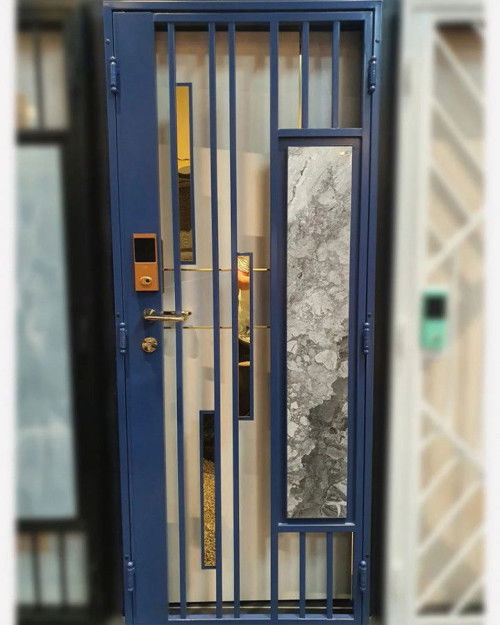
Style Meets Security: Matching Your Digital Gate Lock to Your HDB Gate Design — My Digital Lock
When it comes to your HDB home, the main entrance is more than just a point of entry — it’s a reflection of your style, personality, and attention to security. Your HDB gate serves as the f irst line of defense for your home, and pairing it with the right digital gate lock ensures you get the best of both worlds: robust security and aesthetic harmony. Modern homeowners are no longer satisfied with a one-size-fits-all approach to home security. They want locks that enhance, not clash with, their carefully chosen gate designs. Whether your HDB gate has a sleek, contemporary style or a warm, rustic charm, choosing the right digital lock can elevate the entire look of your entrance while providing cutting edge protection. In this article, we will explore how to match digital gate locks with your HDB gate design, discuss the aesthetic value of stylish options like the “Swarovski Crystal” and “Leather Print” locks, and show you how security can seamlessly meet sophistication. Why Your HDB Gate and Lock Should Complement Each Other Your HDB gate is usually the first thing guests see when they approach your home. A mismatched gate and lock can break the visual flow and create an unbalanced look. On the other hand, a well-paired combination makes your entrance appear intentional, coordinated, and premium. Here’s why matching matters: First Impressions Count — Your HDB gate is part of your home’s curb appeal. A stylish lock enhances its overall design. Seamless Aesthetic Flow — Coordinating finishes, colors, and styles between the gate and lock creates a cohesive look. Enhanced Perception of Security — A high-quality lock that matches the gate signals that you take security seriously without compromising beauty. Value Addition — A beautifully designed gate with a matching lock can even add perceived value to your home. Understanding HDB Gate Styles Before you can choose the perfect digital lock, it’s important to understand the different styles of HDB gates available today. Minimalist Steel Gates — Simple vertical or horizontal bars, often in matte black or grey. Perfect for homeowners who love a clean, understated look. Designer Laminate Gates — Featuring woodgrain laminates or marble finishes for a warm, sophisticated appeal. Glass Panel Gates — Modern, sleek gates with tempered glass inserts that exude luxury. Decorative Wrought Iron Gates — More traditional and ornamental, often featuring patterns, swirls, or floral designs. Custom Powder-Coated Gates — Available in a variety of colors to match interior themes, from Scandinavian to industrial chic. Knowing your gate type will guide your choice of a digital gate lock that not only functions well but looks like it was made for that gate. Stylish Digital Gate Locks That Elevate Your Entrance 1.Swarovski Crystal Digital Lock For homeowners who want to make a bold statement, the Swarovski Crystal digital gate lock is a perfect choice. With its sparkling crystal elements, this lock turns your HDB gate into a luxurious focal point. Best Paired With: Glass panel gates — the reflective surfaces complement each other. Minimalist matte black gates — the crystal stands out beautifully against a dark background. Why It Works: The Swarovski design is glamorous but tasteful, making your entrance look like something out of a luxury apartment showflat. It’s ideal for those who see their gate as more than just a security feature — it’s part of their home’s décor. 2.Leather Print Digital Lock If you prefer a subtle, elegant touch, a leather print lock is a great match. Its textured finish adds sophistication and feels premium without being flashy. Best Paired With: Laminate gates with woodgrain finishes — the leather complements the warm tones. Decorative wrought iron gates — adds a touch of modern elegance to a traditional design. Why It Works: Leather print locks are perfect for homeowners who appreciate understated luxury. The texture blends well with natural and earthy gate designs, giving your entrance a sophisticated yet welcoming look. Color Coordination for a Polished Look When selecting a digital gate lock, color coordination plays a major role in achieving visual harmony. Black Locks — Work well with almost any gate design, especially minimalist or industrial themed HDB gates. Silver/Chrome Locks — Complement stainless steel or light-colored gates. Ideal for a futuristic or modern aesthetic. Gold or Champagne Locks — Add a touch of opulence and work best with marble or woodgrain gates for a classy look. Textured or Patterned Locks — Perfect for breaking the monotony of plain gates and creating a unique focal point. Security Features That Don’t Compromise Style While aesthetics are important, the primary function of a digital gate lock is to secure your home. Modern digital locks come equipped with features such as: Fingerprint Recognition — Quick, convenient, and secure. PIN Code Access — Allows family members to enter without keys. RFID Card Access — Ideal for kids or elderly family members. App Connectivity — Control and monitor gate access remotely. Auto-Locking and Intrusion Alarm — Adds peace of mind when you’re away. The best part is that these features are now available in designs that are sleek and stylish, ensuring that you don’t have to compromise on looks for the sake of safety. Choosing the Right Lock for Your Lifestyle Every homeowner has different needs, and the right lock should fit your lifestyle as much as it fits your HDB gate. For Busy Families — Go for a fingerprint-enabled lock with multiple user storage so every member can enter easily. For Style-Conscious Homeowners — Choose designer options like Swarovski Crystal or leather print locks that elevate the look of your gate. For Tech Enthusiasts — Opt for app-enabled smart locks that let you control and monitor access from anywhere. For Seniors or Kids — RFID card or PIN code access can be more convenient than biometrics. Installation Matters No matter how beautiful and advanced your digital lock is, it must be installed properly to function at its best. Always hire a professional installer familiar with HDB gate structures. Proper installation ensures smooth operation, secure fitting, and longer lifespan for both the gate and the lock. Final Thoughts Your HDB gate is more than just a barrier; it’s a design element that sets the tone for the rest of your home. By choosing a digital gate lock that matches your gate’s style, you not only enhance security but also create a visually stunning entrance. From the luxurious Swarovski Crystal locks to the understated elegance of leather print f inishes, there is a digital gate lock to suit every taste and HDB gate design. Whether you prefer a modern, minimalist look or a warm, classic style, the right combination can make your entrance both secure and stylish. Pop over here : https://www.mydigitallock.com.sg/hdb-gate/
Read more